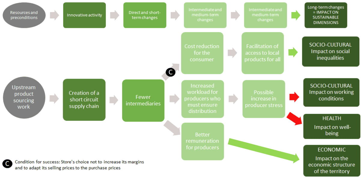


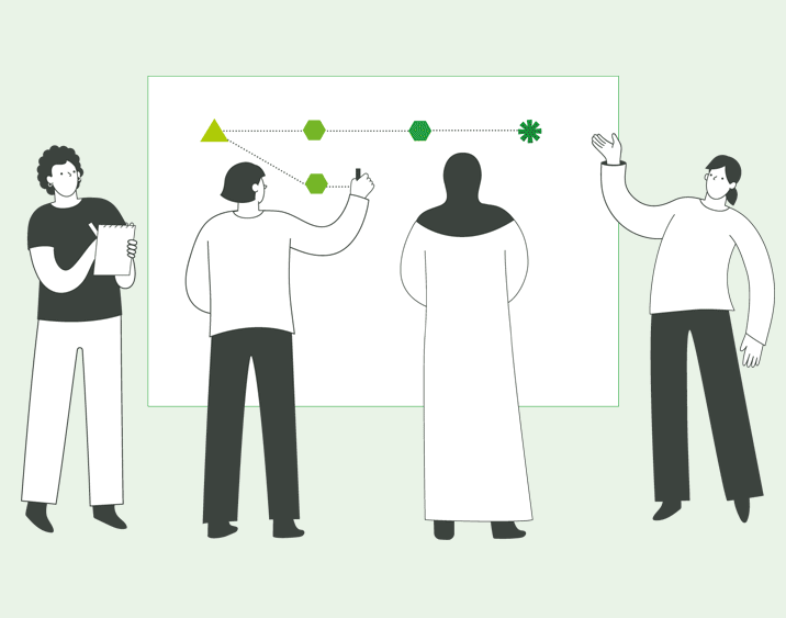


The diagram below helps you understand how to read an impact pathway map.

A typical impact pathway map begins with the innovation and the related action (or activity) on the left hand side of the diagram and progresses to the right. This activity is helped or constrained by existing preconditions. The activity then creates a short-term, direct change that in turn can lead to medium term outcomes and longer term impacts. In this map, these flows are captured using lines and arrows. Wherever possible it is useful to identify the conditions that enable or impede success along the way. While this information can be represented using different colours (in this case green for positive and red for negative), it can be more accessible if different shaped symbols are used. Finally, on the right hand side of the map, the pathway ends with related sustainability dimensions.
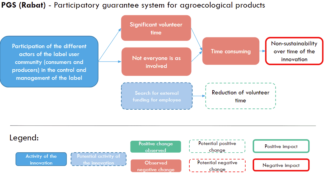
The link below displays one example of data processing using the Urbal approach : Ma Cantine Autrement. The process results in a revised final map enriched with interviews data, collective reflections on conditions of success, facilitating conditions and brakes, and rephrased in a homogeneous way to improve its usability.
https://docs.google.com/document/d/14PxF36of_6z3nBBkQIo8w3oev-cr57G4YvcZHppDEaM/edit?pli=1